Saavy Creative Agency
X
Press Mailer Project

Project Scope
Create a press mailer related to your favorite tv show or movie. Must have the following elements:
- Packaging Design (Inside/Outside Box)
- Interior Layout Design
- Mailer Contents (Strategy/Creation)
- Rendered Presentation
Twilight x Anniversary
A modern re-release campaign concept celebrating the cultural phenomenon of Twilight through elevated nostalgia packaging and collectible lifestyle products.
The mailer reimagines the original Twilightera through a contemporary lens by blending 2000s fandom culture, Tumblr-era aesthetics, and modern editorial packaging design.
My Strategy
For this project, I wanted to create a concept rooted in something culturally recognizable, emotionally nostalgic, and still highly relevant within today’s trend and consumer landscape. I chose Twilight because the franchise continues to maintain an extremely active and loyal fan base years after its original 2008 release, while simultaneously experiencing a major resurgence through Y2K nostalgia, Tumblr-era aesthetics, and modern fandom culture online.
Rather than approaching the project as traditional movie merchandise, I wanted to reimagine Twilight through the lens of a modern lifestyle and nostalgia-driven press campaign. The goal was to create something that felt commercially believable within today’s market while still emotionally connecting to the original audience that grew up with the franchise. By blending collectible editorial pieces, trend-driven products, and elevated packaging design, the final direction was designed to feel immersive, culturally aware, and visually aligned with contemporary lifestyle branding and influencer marketing.
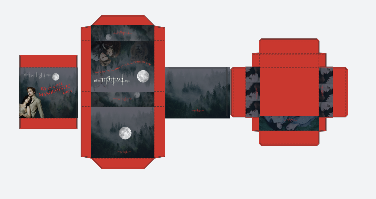
Part 1: Box Design
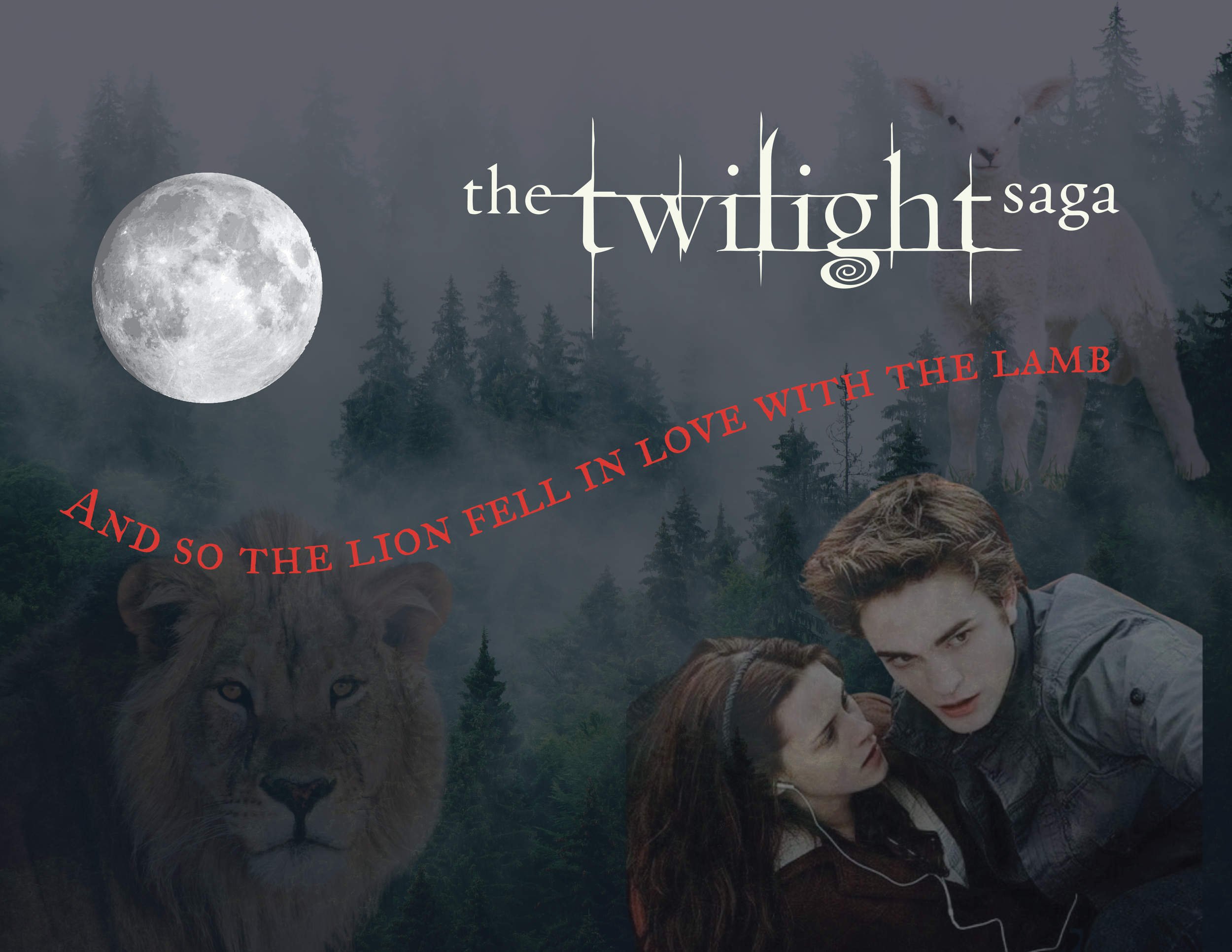
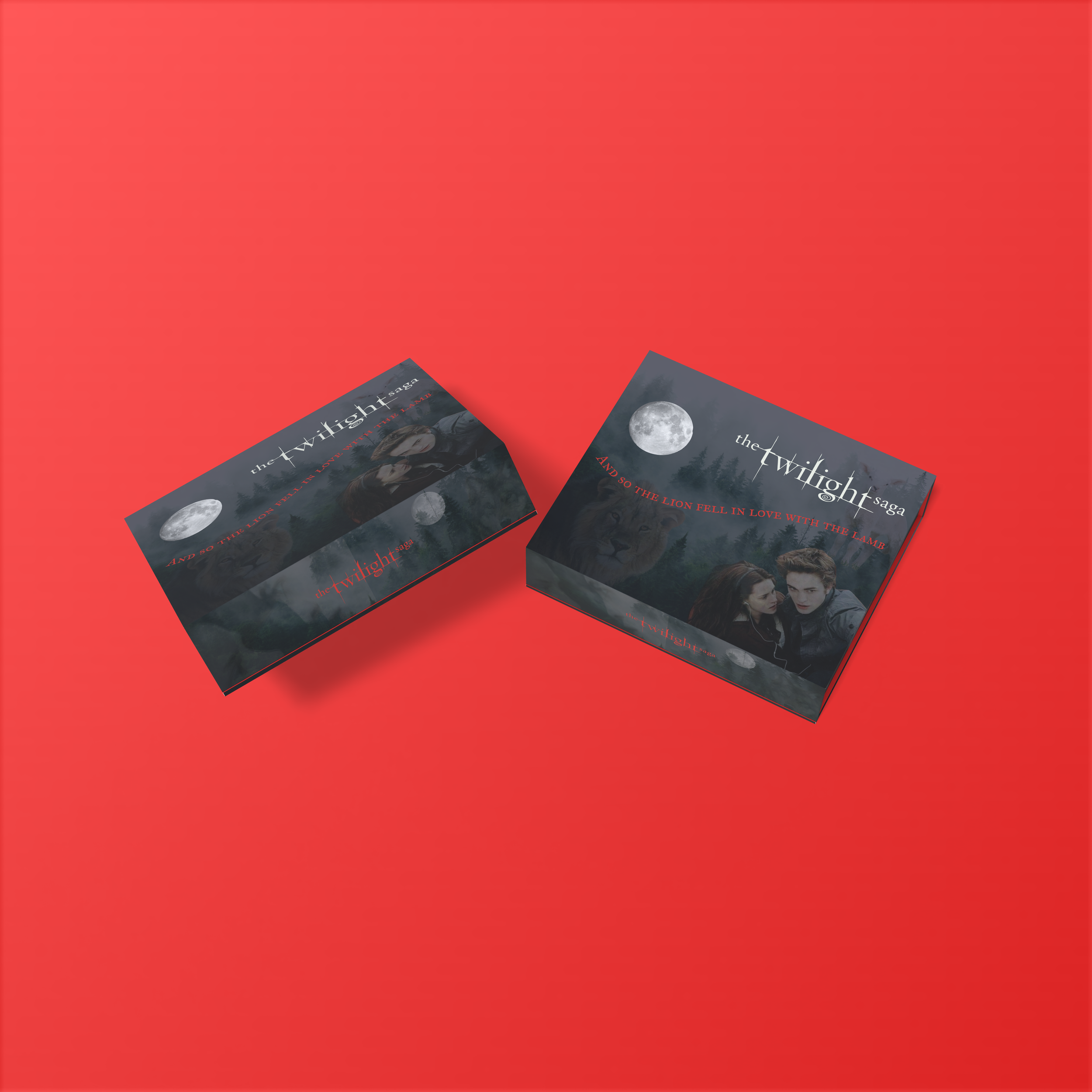
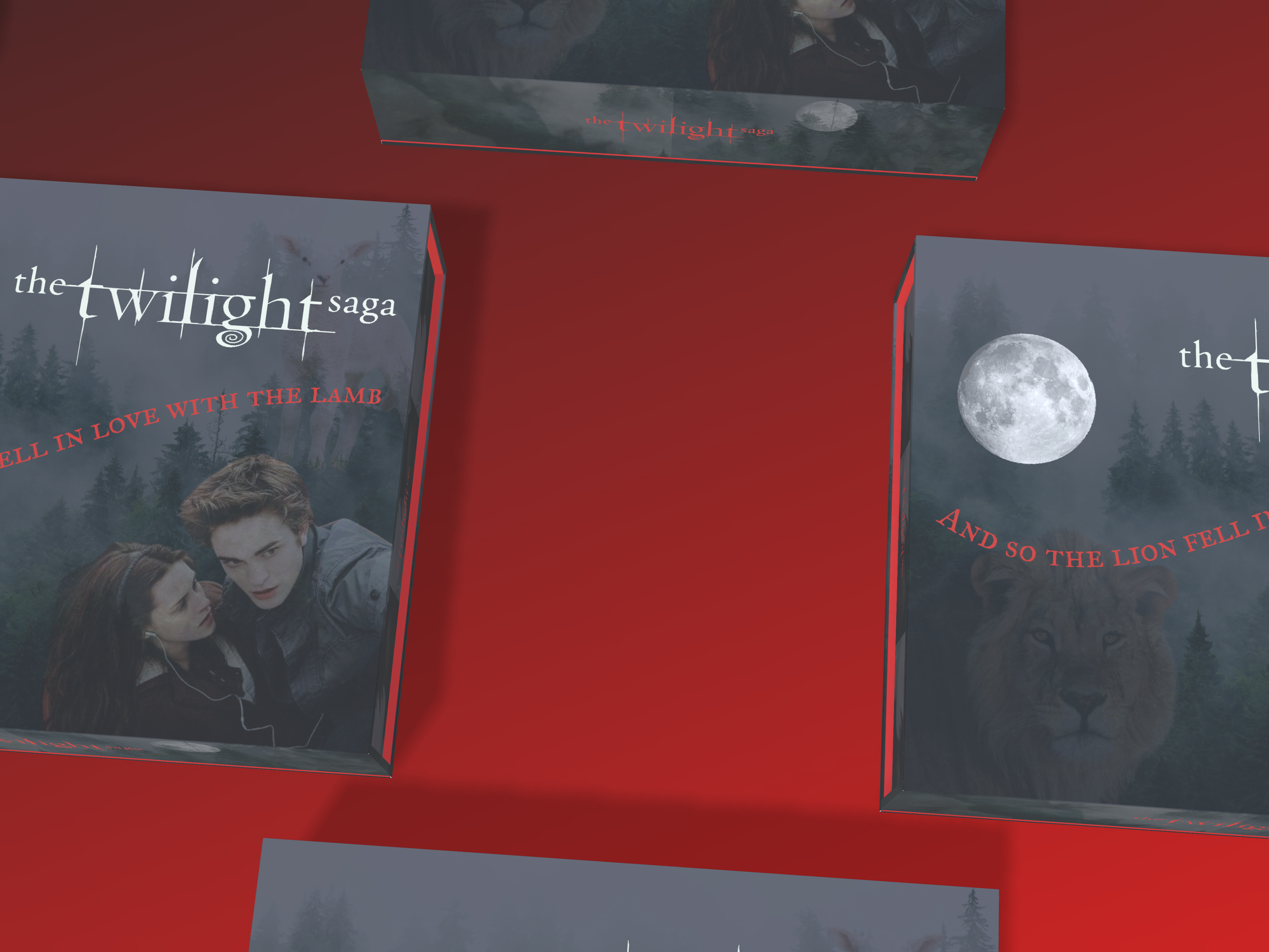
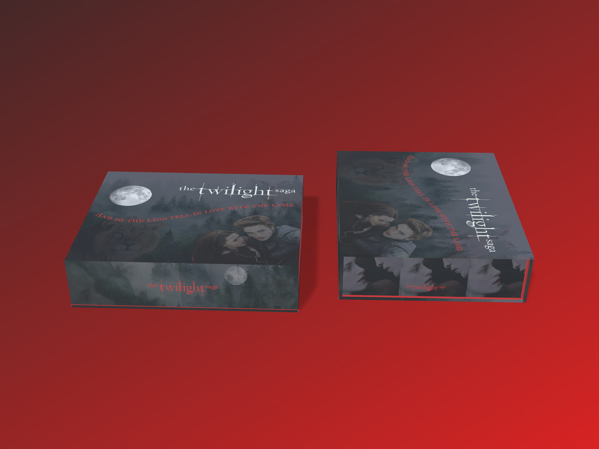
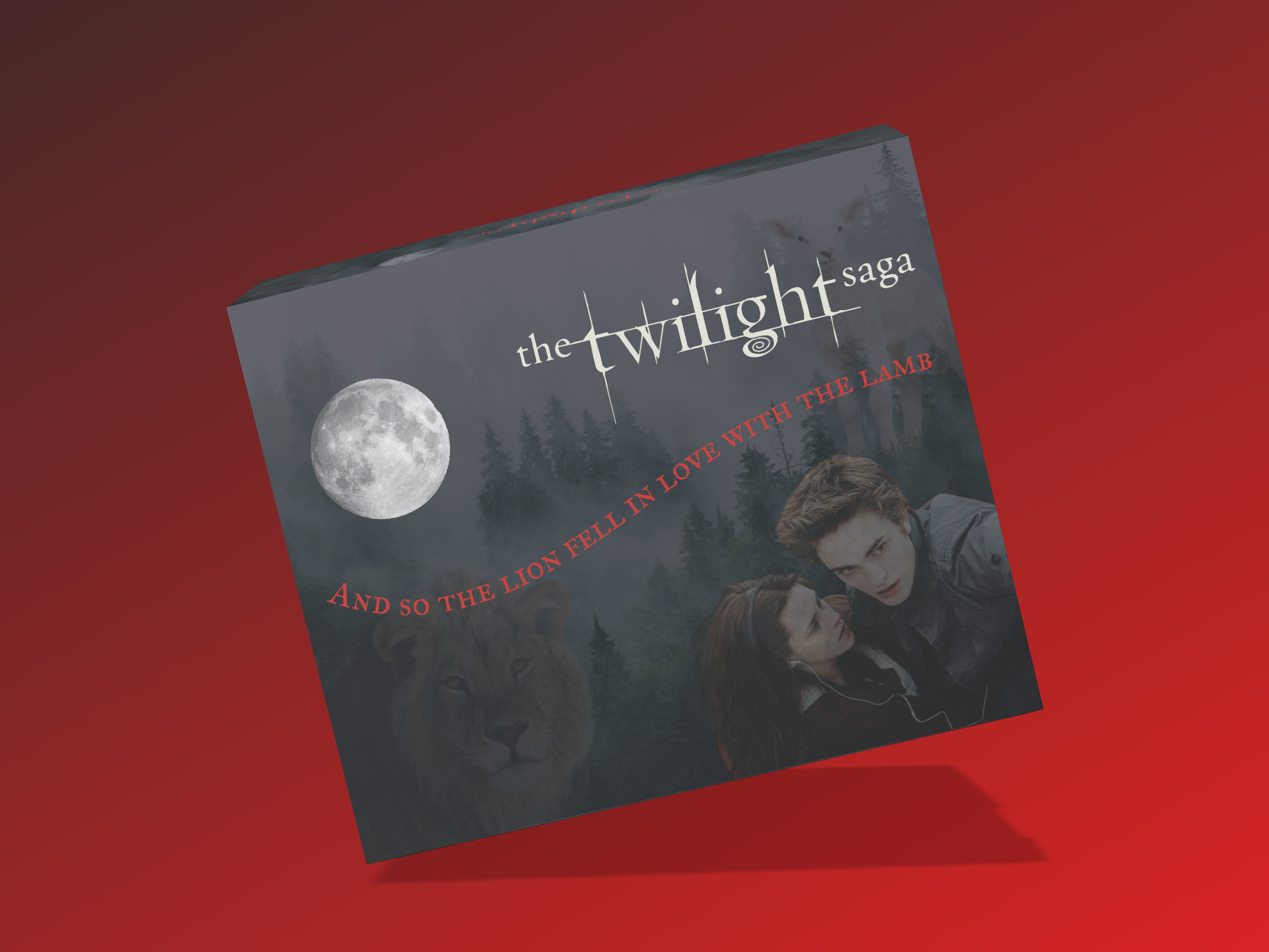
For the packaging design, I wanted the box to immediately capture the emotional atmosphere and tension that made Twilight such a recognizable cultural phenomenon. The overall visual direction pulls from the original cinematic language of the franchise through layered fog, forests, moonlit elements, deep charcoal tones, and red typography to create something that feels dark, nostalgic, romantic, and slightly dangerous.
The quote placed on the exterior, “And so the lion fell in love with the lamb,” was intentionally paired with layered visuals hidden throughout the design itself. On the lower left side of the box (cover), there is a subtle glimpse of a lion hidden within the darker imagery, while the upper right side contains a faint image of a young lamb layered behind the fog and trees. Although these elements are not part of the main focal point, they subconsciously support the emotional storytelling of the quote and become part of the viewer’s overall perception of the packaging.
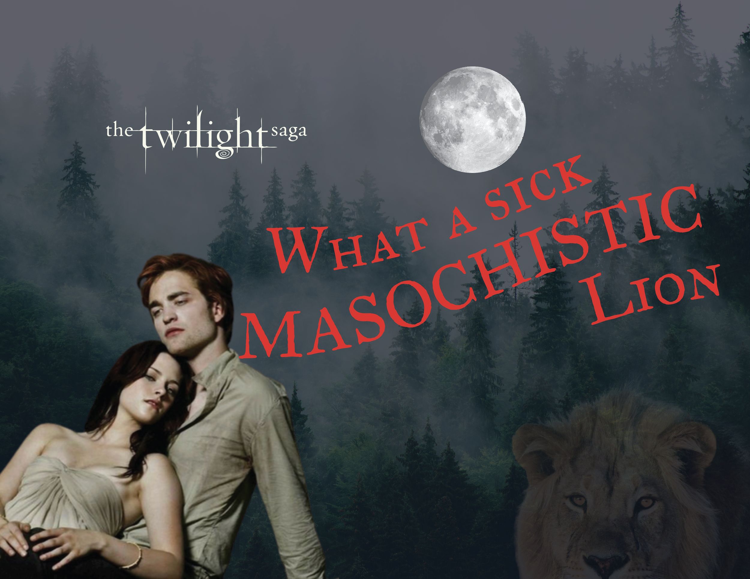
When the box is opened, the second half of the quote, “What a sick, masochistic lion,” is revealed inside the mailer to create a more intimate and unexpected moment within the unboxing experience. By separating the quote between the exterior and interior of the packaging, the box itself becomes part of the storytelling experience rather than simply functioning as a container for the products inside.
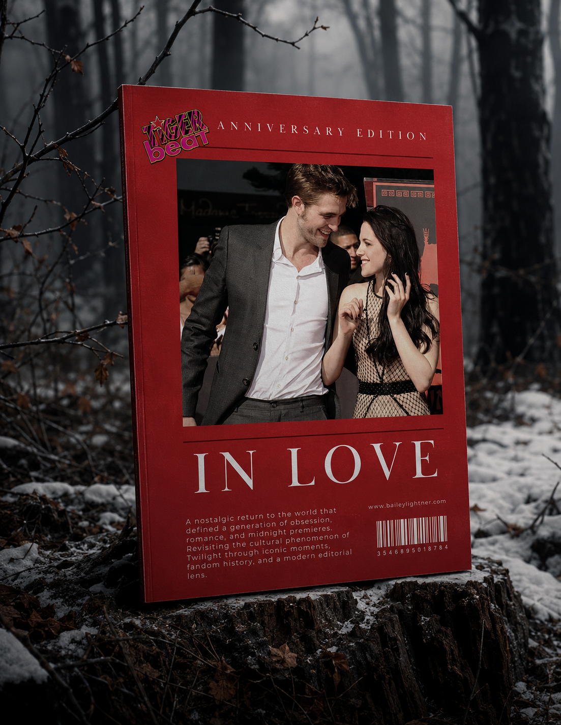
The image on the front of the box was chosen from the scene after Edward saves Bella from the van in the high school parking lot. It captures one of the first major moments of tension and attraction between the characters, when Bella is beginning to fall for Edward while still unsure of who he really is. For audiences who grew up during the original Twilight era, this scene is instantly recognizable and tied to the emotion, mystery, and obsession that made the franchise so memorable.
Part 2: Interior Layout
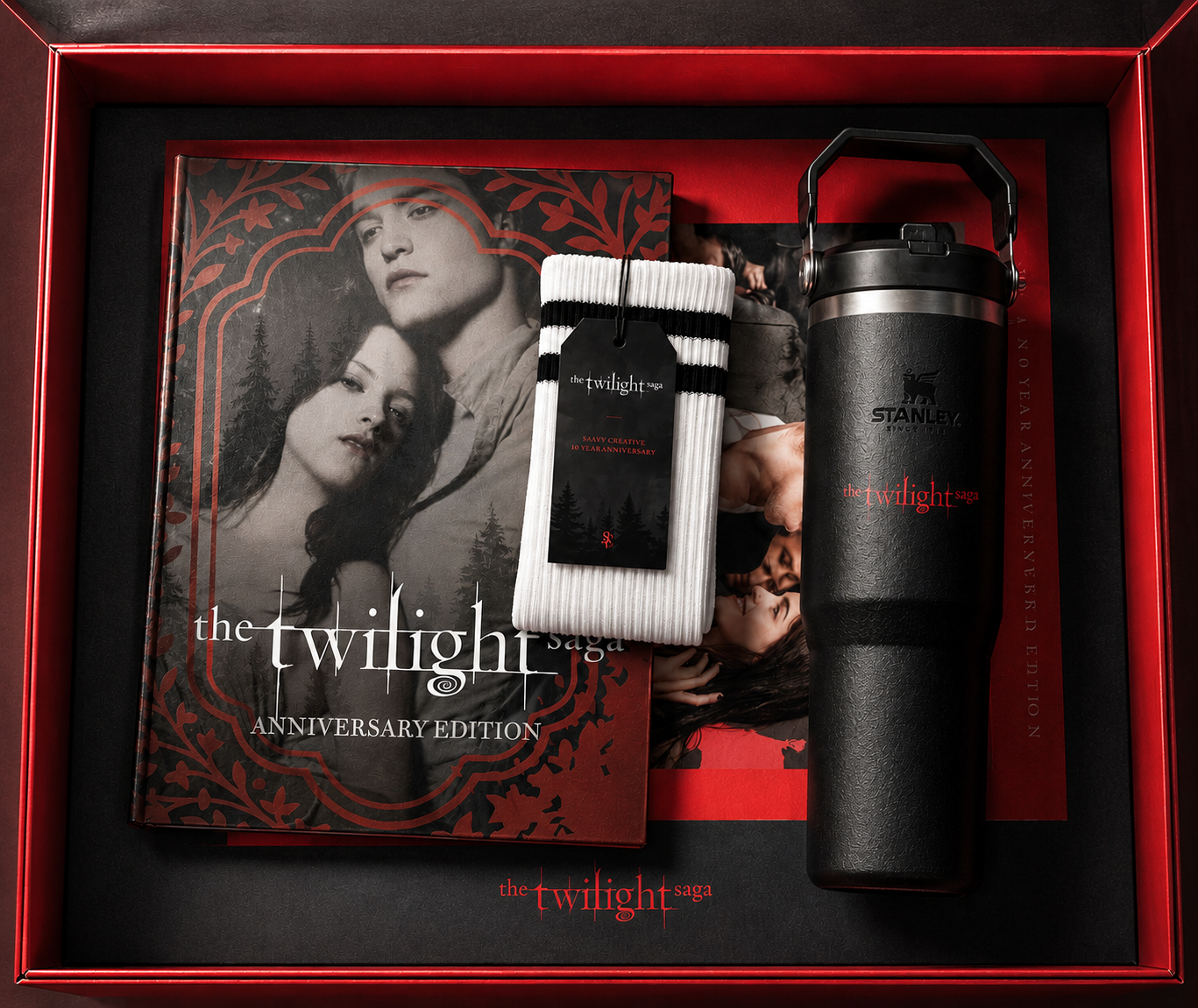
For the internal layout of the mailer, I wanted the product arrangement to feel intentional, balanced, and visually layered in a way that guides the unboxing experience naturally from top to bottom. The placement of each item was designed to create hierarchy within the box while also balancing larger lifestyle products with collectible editorial pieces.
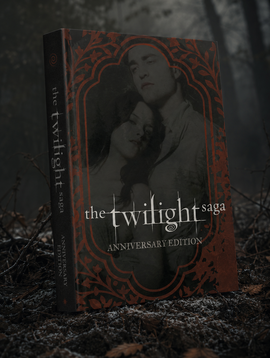
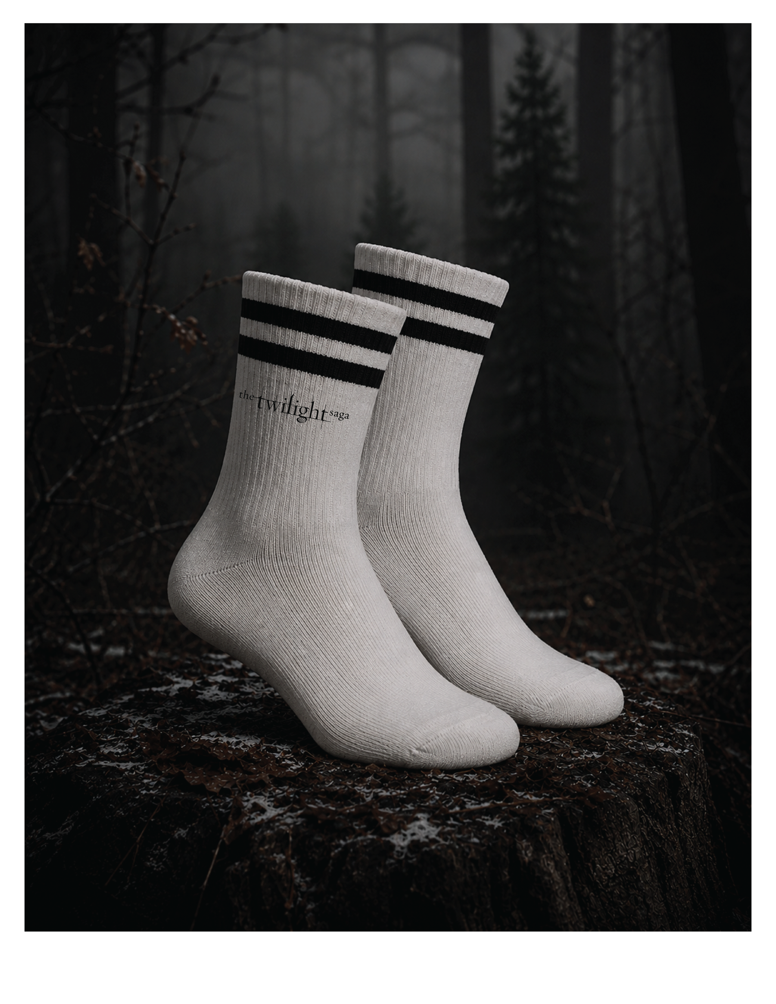
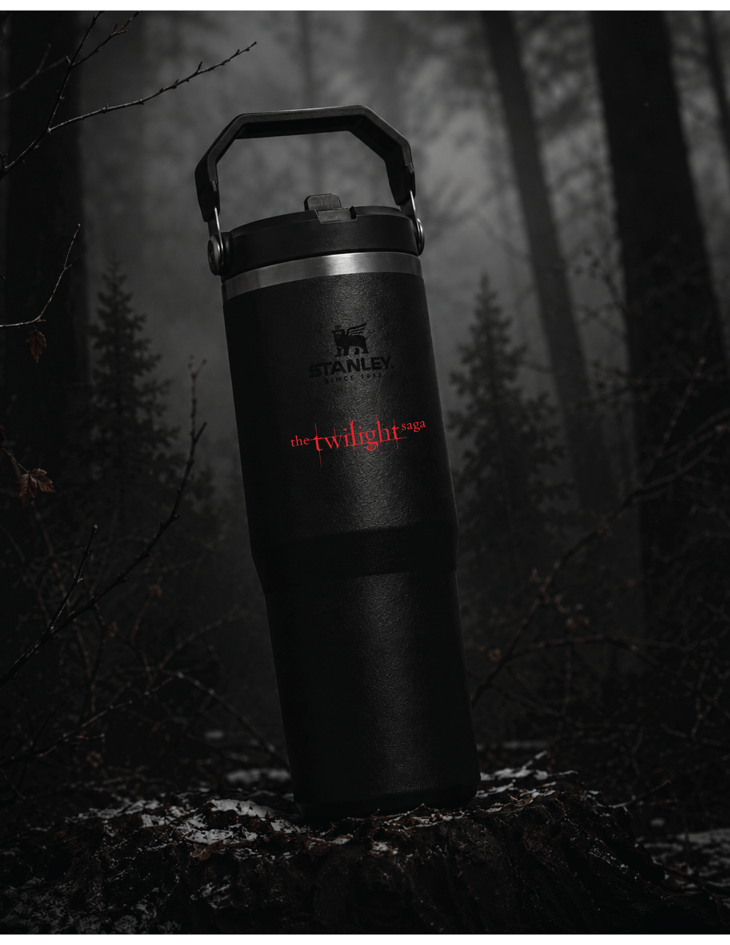
The magazine was positioned at the base of the mailer to function as the foundational storytelling piece of the experience, anchoring the overall nostalgia-driven concept. The special edition book was layered above it to reinforce the collectible and cinematic nature of the franchise, while the baseball-inspired socks introduce a more casual and trend-driven lifestyle element tied directly to one of the film’s most iconic scenes. The Twilight x Stanley water bottle was placed alongside the editorial pieces to act as the primary hero product within the kit, balancing functionality, current consumer trends, and modern influencer-style product marketing within the overall presentation.
Part 3: Mailer Contents
The contents of the mailer were curated to balance nostalgia, collectibility, and modern lifestyle trends while still feeling cohesive within the world of Twilight. Rather than creating traditional movie merchandise, each product was selected to feel like part of a contemporary anniversary campaign designed for today’s audience and influencer-driven consumer culture.
The collectible magazine functions as the primary storytelling piece within the mailer, featuring iconic moments, fandom nostalgia, visual trends, and cultural references tied to the franchise’s lasting impact. The inclusion of the Tiger Beat logo was intentionally designed as a nostalgic callback to the original media culture surrounding the films. The special edition presentation of Twilight Book 1 reinforces the collectible nature of the experience while connecting back to the original source material that built the fandom itself.
The Twilight x Stanley water bottle was included as a trend-driven lifestyle product intended to modernize the campaign concept and position the mailer within current consumer culture and social media marketing aesthetics. The baseball-inspired socks reference one of the most recognizable scenes from the franchise while introducing a more casual and wearable fashion element tied directly to the nostalgia of the original films. Together, the contents were designed to create a cinematic, emotionally familiar, and culturally relevant unboxing experience that feels both collectible and commercially believable.
Part 4: Rendered Presentation
I created the renders for this project using Adobe and Pacdora. I would be interested in learning Adobe Dimension as part of furthering my knowledge in the 3D builder space.