
Ascent Cannabis
Ascent Cannabis is a cannabis brand positioned around elevation, clarity, and experience. Inspired by mountain landscapes and the feeling of ascent, the brand needed a visual identity that felt refined, grounded, and distinct from overly playful or saturated cannabis aesthetics.
Industry: Cannabis / Retail
Scope: Brand Identity, Packaging Design, Merchandise, Environmental Graphics, Marketing Assets

Ascent had grown through strong word of mouth, but its brand and website lacked cohesion. Service and retail offerings were unclear to new clients, and the overall visual language did not align with the level of care and experience being delivered.
The Challenge
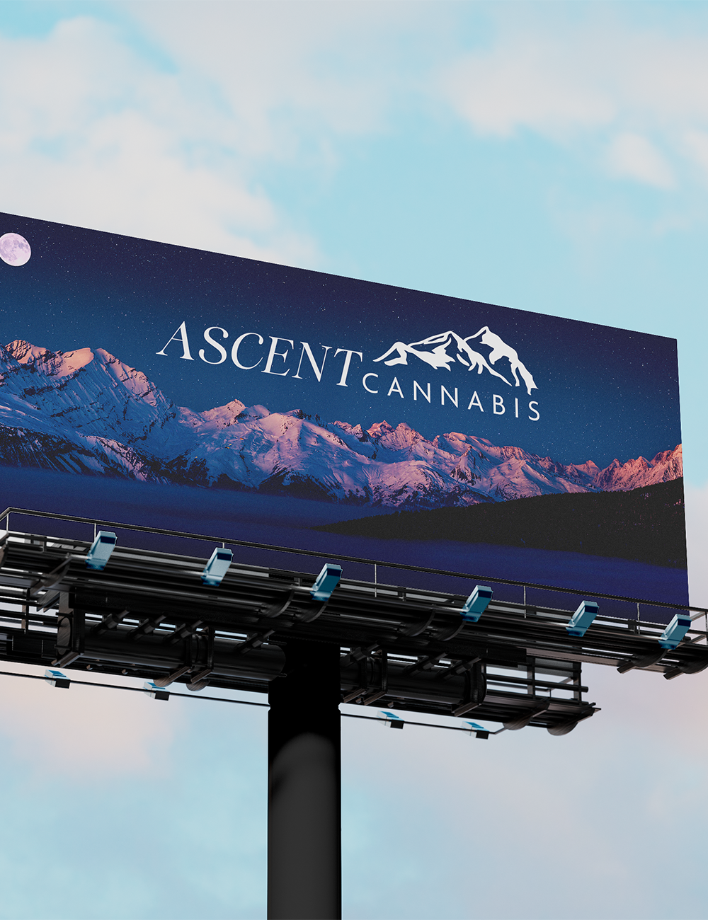
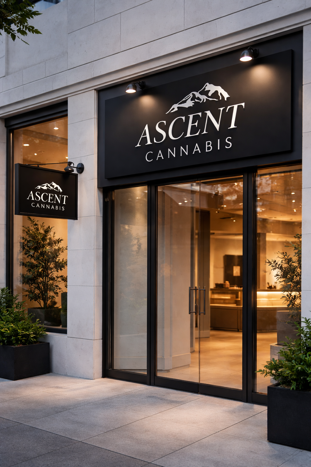
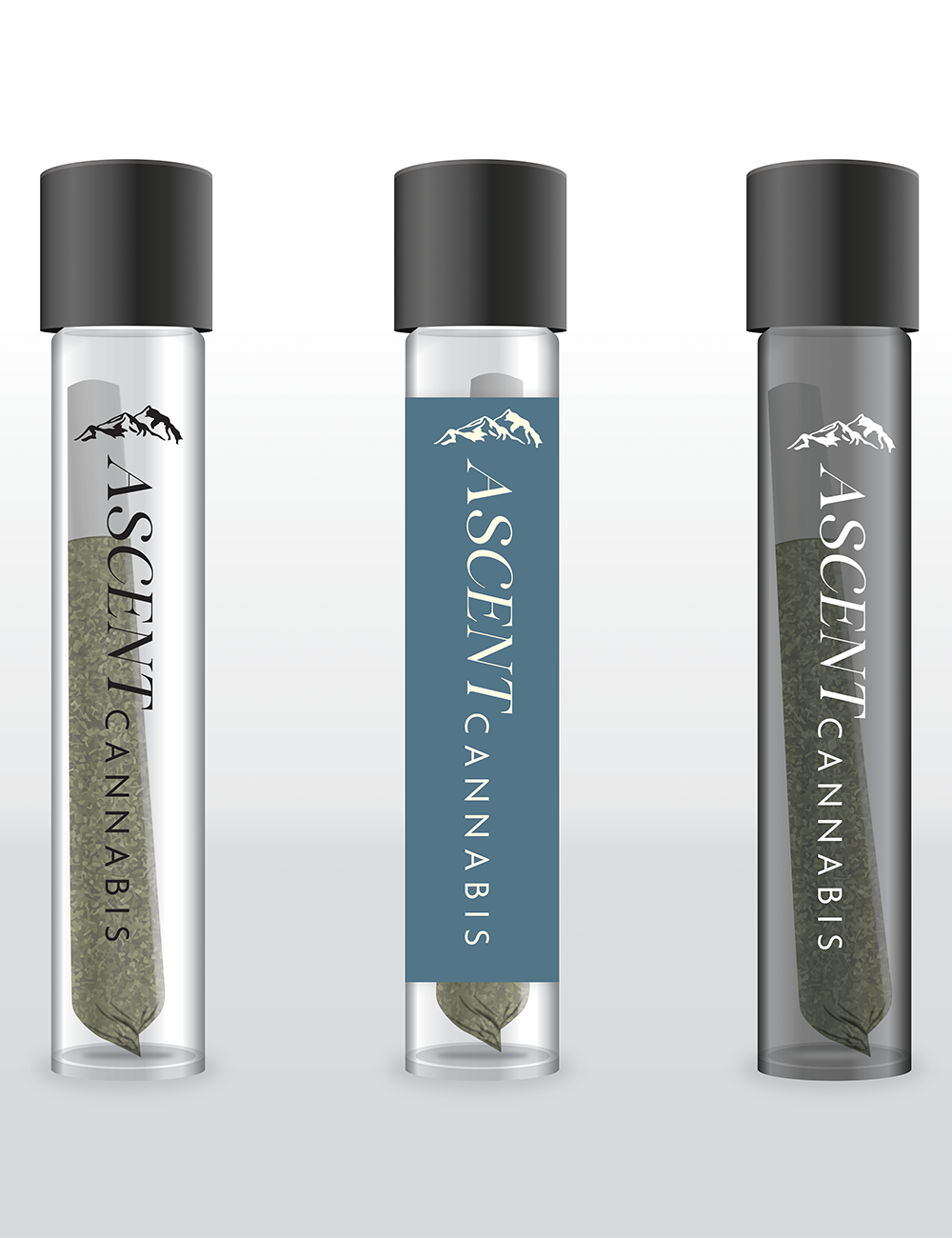
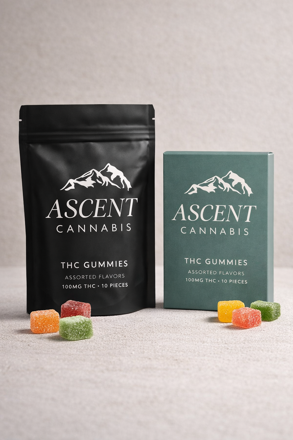
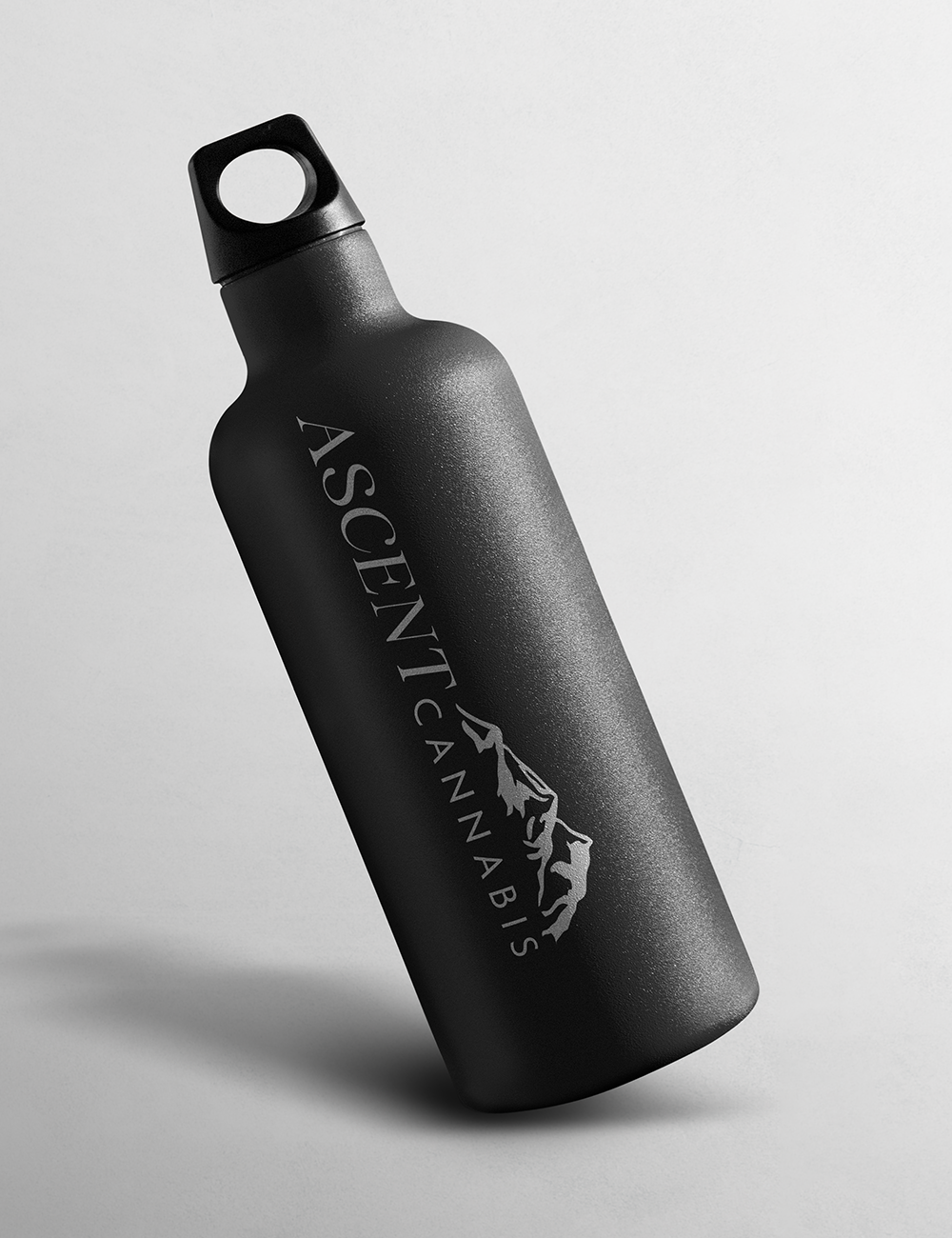
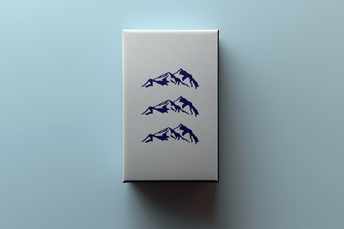
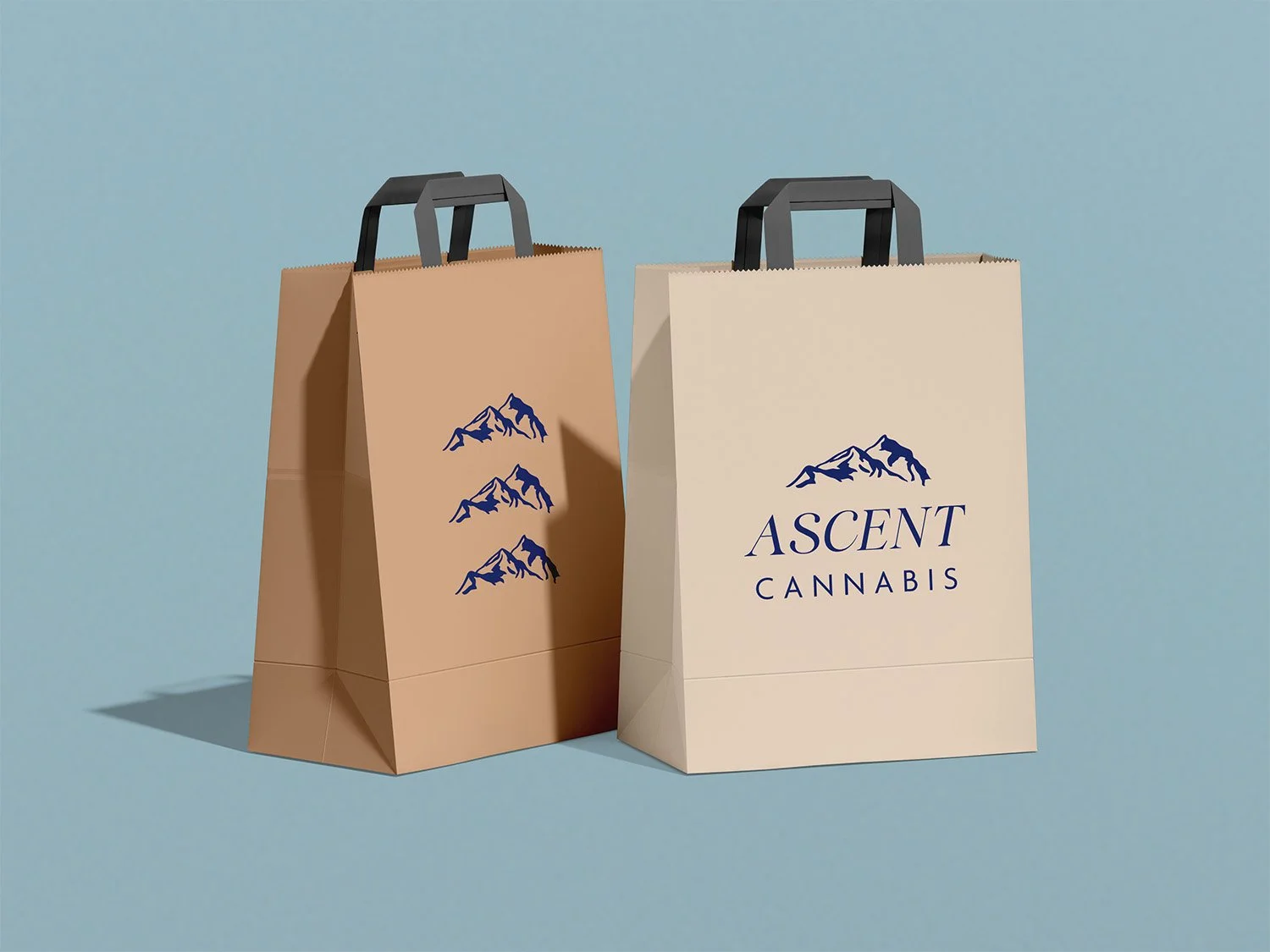
The identity is built around a strong, minimal wordmark paired with a mountain symbol that anchors the brand in a sense of place and progression. A serif typeface introduces a level of sophistication, while the spacing and scale create a feeling of openness and calm. The visual language leans restrained and intentional, allowing the mark to feel premium without becoming inaccessible.
The Approach
The resulting identity positions Ascent Cannabis as clean, grounded, and elevated.
The identity extends across packaging, retail concepts, and advertising, positioning the brand within a more elevated and experiential space.
The Outcome
Brand Identity
Logo Design (Primary Mark + Symbol)
Typography Direction
Color Palette
Packaging System Concepts (Pre-Rolls, Jars, Edibles)
Out-of-Home Advertising (Billboard)
Retail & Display Concepts
Brand Application Mockups
The Deliverables